Graphic Tools on Charts
There are a huge number of different analytical tools on the price charts that allow for effective trading. Most of them are quite simple at their core.
Contents
Price scale
The price chart is built in a rectangular two-coordinate system, the horizontal abscissa axis is time, the vertical ordinate axis is price – the price scale (Fig. 1). There are two types of price scale representation: arithmetic and logarithmic. The arithmetic scale shows the absolute increase in price, the logarithmic price scale shows the relative increase.
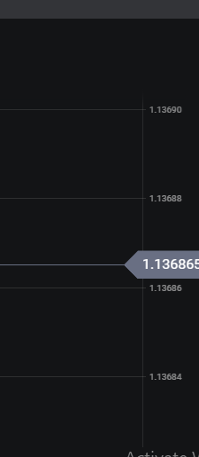
Image. 1
For example, on an arithmetic scale, the segment between $1 and $10 is the same length as the segment between $1,001 and $1,010, although the percentage difference between the values is very different. On a logarithmic scale, the jump in price for different prices will occupy the same distance if the percentage increase is the same. As the percentage change in price decreases, the segments on the logarithmic scale will also decrease.
Displaying prices on an arithmetic scale is suitable for tracking prices in a narrow range of fluctuations, for quick analysis and quick trading strategies. The logarithmic scale is more convenient for analyzing a relatively wide range of prices regardless of the time period. Trend lines are more distinct on the logarithmic scale. Logarithmic scale shows dynamics of the price and speed of dynamics, so it is more suitable for long-term forecasting.
Horizontal line
Horizontal lines are used to display any marks that show the consistent dynamics of any processes on the graph, such as price fluctuations (Fig. 2).
More about horizontal lines on stock charts in this article.
Most often horizontal lines display support and resistance levels, but a trader can use an unlimited number of horizontal lines in any area depending on the objectives. Horizontal line is convenient to show long movements on the market, which allows to estimate the strength of certain trends.
Image. 2
The horizontal line allows you to keep the trader’s attention, in particular on the extremes, without getting confused with a large amount of data, especially on a short timeframe. Horizontal lines are also used for analyzing completed trades – they can be used to highlight areas on the chart where trades have been concluded.
The main purpose of horizontal lines can be considered as ordering of trading, introducing more logic into the trader’s actions, marking the patterns of price movements. It increases the efficiency of trading.
Trend line
The trend line (Fig. 3) is probably the main graphical analysis tool for the trader. Despite its simplicity, it contains a lot of information. Simplified, the trend line is a display of any indicators, such as prices, most often, depending on time.
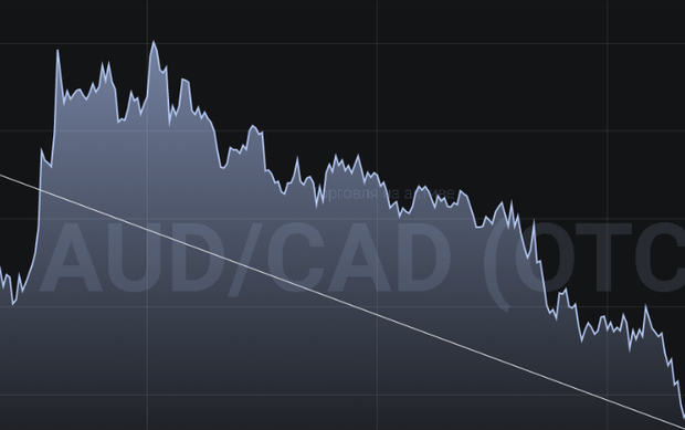
Image. 3
There are three types of trend lines: upward (so called “bullish trend”), when asset prices are rising; downward (so called “bearish trend”), when asset prices are falling; sideways (flat) – long small price fluctuations.
More about trend lines on stock charts in this article.
An upward trend line is defined by the fact that its right end is higher than the left end on the chart. An upward trend line shows that there is a steady demand in the market, there are more buyers than sellers, or they are more active than sellers.
A downtrend line, respectively, looks like a line whose right end is placed below the left end. Such a trend shows that sellers dominate the market, supply exceeds demand.
For the trend line, it is important to correctly select the points through which it will pass. The trend is plotted from right to left, with current prices displayed on the right side of the chart and old price values displayed on the left. The correctness of the construction should be checked by additional parameters.
But on the chart of the trading platforms everything necessary in the construction of the trend is taken into account. Therefore, the main thing for the trader is the ability to interpret the information correctly.
First of all, obviously, the trend line is needed to determine the trend. And also on the line you can see signs of a trend change, which allows you to find profitable entry or exit points from trading.
Patterns are formed on the trend line – typical graphical figures that show how the situation will develop further. Many trading strategies are based on these patterns.
When analyzing the trend line, it is important to consider the time scale, duration, frequency of price touches of the line if it is drawn on the extremes, the slope angle of the line, which shows the strength of the trend.
Thus, the longer the time frame the trend line is formed, the more stable it is. The trend line on the daily chart is more stable than on a shorter timeframe. Respectively, the longer the trend line, the more stable and reliable for analysis and prediction.
The more often the price touched the trend, the more stable the trend is forming (example of trend trading). The sharper the angle between the horizontal and the trend line, the stronger the trend is, the more active the trade is. Smooth trend lines show that the market is weak.
Section
The segment is one of the main elements of the chart. The segment (Fig. 4) can be of any size, according to the objectives set by the trader. But, depending on the location and type of chart, the segment can be very informative. In principle, the trend itself is a segment of a longer sequence of values.
The segment of the trend line, as a rule, temporary (but not all charts take into account time intervals), allows you to estimate the local movement of the price of the asset. You can use it to see the supply and demand ratio directly at the time of trading.
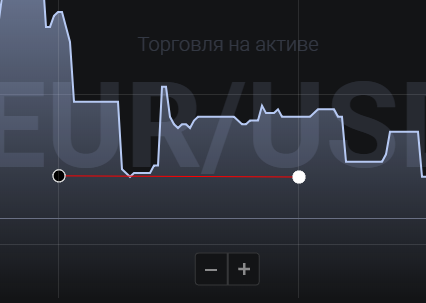
Image. 4
There are a large number of trading strategies based on time intervals – 5-minute, 15-minute, 30-minute and so on, which are automated on trading platforms.
By the way, there are graphs that are constructed entirely of segments, in particular, bar chartThe “vertical segment”, very popular with traders, consists of vertical bars, each of which denotes a different trading period, the minimum and maximum price.
Ray
Ray (Fig. 5) is a geometrically infinite extension of the trend line to the right or left on the graph. But on the graph it is a line plotted against two selected values and extended to the last value on the graph. Its difference from the trend line is that part of the information is cut off, it allows you to see very clearly the main direction of the trend at a certain time.
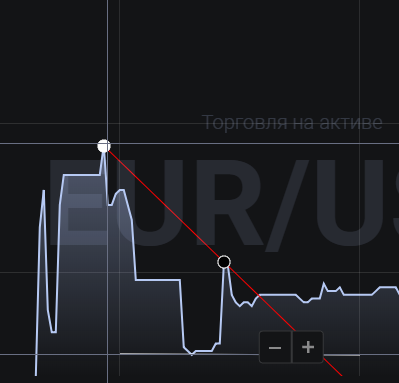
Image. 5
Therefore, the beam can be used to predict the market situation and it is included in the list of tools on the trading floors. On the basis of the ray a number of trading strategies.
For example, the rays on the chart are built on the minima. Transactions to sell are carried out when the minimums marked by the rays are broken. Similarly, you can use the rays for transactions on the highs.
Support and Resistance Levels
Support and resistance lines (Fig. 6) are the basis of all technical analysis. Everything that concerns price dynamics is considered in relation to the support and resistance lines, all figures, patterns are formed by these lines.
Any shapes and patterns you see on price charts are just certain combinations of support and resistance lines (example of trade by the support and resistance lines).
Support and resistance lines represent the struggle between bulls (players making money on rising asset prices) and bears (players making money on falling asset prices) when trading assets.
Support – shows the level of price control by bulls, resistance – the level of price control by bears.
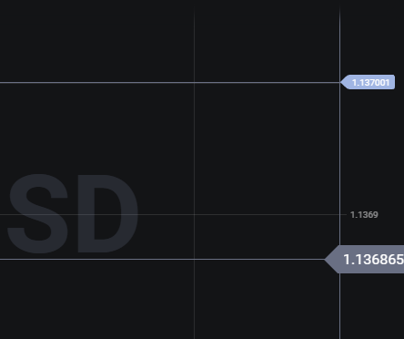
Image. 6
Resistance lines connect the highs and are formed when buyers are no longer willing to buy the asset at prices higher than those already reached. An established resistance line indicates that sellers of the asset have gained some advantage and the price may move downward.
Support lines connect the lows and are formed when sellers are not willing to sell the asset at lower prices than those set. Buyers show that they have achieved dominance, in which case the price of the asset can go from falling to rising. At support and resistance levels, traders enter the market to try to reverse the trend.
For example, when the price stops on an upward move, it is a signal for sellers to enter the market and try to stop the trend. If that fails, sellers may try to knock the price down at the next resistance line. Similarly, on a downward move, when a support line is formed, buyers enter the market and try to stop further price declines.
Andrews’ pitchfork
Andrew’s Pitchfork (Fig. 7) is a technical indicator developed by the famous trader Alan Andrews. This indicator turned out to be so effective that it has become a full-fledged trading tool. Andrews’ Pitchfork is used to identify support and resistance channels and to predict the direction of asset price changes.
Andrews’ Pitchfork represents three parallel lines, which are drawn on three consecutive maxima or three consecutive minima on the chart. In particular, on an ascending trend the pitchfork is drawn in the sequence minimum – maximum – minimum, and on a descending trend – maximum – minimum – maximum. The first line is drawn from the initial point (“handle” of the pitchfork) through the center of the segment that connects the second and the third extrema. And two lines are drawn parallel to the first line on the chart through the remaining points (“teeth” of the pitchfork).
When trading, a trader can be guided by the support and resistance lines, which Andrews’ Pitchfork shows in relation to the Andrews’ Pitchfork middle line. Price movements inside the channel formed by the pitchfork show that the trend continues to develop. Breaking through the borders of the channel shows that the whole trend changes direction.
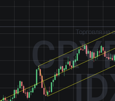
Image. 8
Traders have noticed a number of peculiarities of using Andrews’ Pitchfork. For example, if the price of an asset breaks up the upper descending line of the corridor, it is a signal to buy the asset. If the price of the asset breaks through the lower ascending line of the corridor, it is a signal to sell. If the price does not reach the center line of the pitchfork and breaks through the upper line upwards, traders buy. And, vice versa, if the price does not reach the central line and breaks through the lower line of the corridor, it is time to sell.
Andrews’ Pitchfork is part of the standard set of trading tools on trading floors (binary options platforms, Forex brokers, crypto exchanges). They have been in use for decades and care must be taken when using them, especially to determine entry points. Traders use them with additional indicators.
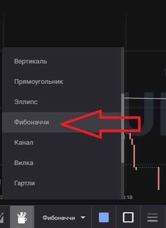
Fibonacci Levels
Fibonacci Levels (Fig. 8) are based on a sequence of numbers first described by the eminent Italian mathematician Leonardo Fibonacci back in the 13th century. This is a sequence of numbers in which each successive number is the sum of the previous two: 1, 1, 2, 3, 5, 8, 13, 21… and so on. In the sequence, dividing any number by the previous number always results in a ratio of 1.618. Fibonacci numbers have a lot of “magic” properties and some of them are used in trading. Fibonacci numbers can be used to identify potential retracement targets, potential trend continuation values, identify strong support and resistance levels.
_
In trading, it is believed that the trend is corrected at levels that correspond to the laws of the Fibonacci number series, ie, a correction or trend reversal occurs at levels 23.6%, 38.2%, 50%, 61.8%, 76.4%. Therefore it is possible to establish a line between the beginning of a trend and its maximum, and on this line to mark levels 23.6%, 38.2%, 50%, 61.8%, 76.4%.
It is considered that levels 38.2% and 61.8% are the strongest, i.e. Fibonacci patterns are shown best at these levels. Fibonacci levels are recommended for use with the support of additional instruments and indicators, confirming the movement of the trend. Fibonacci levels are not recommended if there is no clear trend. The tool can be used on any timeframe and on any assets.
Fibonacci Levels tool (example of trade) is on the traders’ platforms in the list of standard tools.
By the way, the Fibonacci number series is the basis of another popular trading methodology among traders – the wave theory of mathematician Ralph Elliott. According to this theory, it is believed that the price moves upwards in a wave-like manner and reaches the maximum from the minimum in eight waves: five impulse waves and three corrective waves. The eight waves also go from the maximum to the minimum on a downtrend.
Fibonacci Fan
A number of instruments based on Fibonacci numbers are available on many trading floors, in addition to levels. These include Fibonacci Fan, Fibonacci Extensions, etc.
Fibonacci Fan (example of trade) shows resistance and support levels at which a correction is most likely to occur. The fan is built according to the set Fibonacci levels by two extrema through which the centerline is drawn. There are three types of Fibonacci Fan: direct, correctional, and built-in.
The Fibonacci Straight Fan is constructed by connecting points of minimum and maximum on an uptrend or points of maximum and minimum on a downtrend. A straight fan is used until the correctional level of 23.6 is broken. Then the fan should be reconstructed. Because of its specificity, it is recommended to use the fan as a tool on the flat, long price movement without significant fluctuations. Some traders think, on the contrary, that the Fibonacci Fan works better on a volatile market when it can help to distinguish the exact signals from the plenty of false ones.
The Fibonacci Correction Fan is the most popular type of fan. It is built after the correction level is broken at 23.6. The point from which the fan axis is constructed – the maximum on an uptrend or the minimum on a downtrend – remains in place, and the second point is transferred to the first wave of correction, which is determined by the top of the wave. And each subsequent correction is expected to be at 38.2, 50, and 61.8, in sequence. And from the last mark, we can expect a change in the trend.
A Fibonacci counter fan is assumed after the price breaks the 61.8 level indicated by the retracement fan. This may mean that a new trend has formed. The starting point of the new fan, the zero point, is the same – the minimum on the uptrend, the maximum on the downtrend. The second point is at the top of the wave, which emerged before the correction level at 61.8.
It is not recommended to use only Fibonacci levels in trading. Its indicators should be complemented with indicators data, because in practice it is difficult to distinguish true signs of Fibonacci levels from false ones.
Moving average
The moving average (or moving average) (Figure 9) is one of the oldest and most widely used tools on traders’ charts and is included in the basic list of tools on all trading floors.
Moving average (example of proper operation) represents the average price of an asset over a certain period of change, that is, it cuts off small price fluctuations and shows the main direction of the trend.
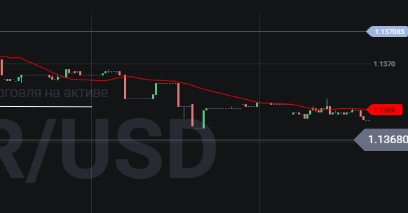
Image. 9
Moving averages come in many forms. In particular, it is a simple moving average, SMAwhich is calculated as the arithmetic average, for example, the prices of ten bars are summed and divided by ten. The SMA can mostly be used to analyze price dynamics over long time intervals.
Exponential (EMA) is used for analysis on short timeframes, because it shows an average in which current prices are more important than the old ones. The EMA is calculated using a more complex formula. Most intraday strategies use the exponential average.
And a number of additional indicators are based on it: Adaptive Moving Average (AMA), which is characterized by minimal lag when the trend changes, Double Exponential Moving Average to track the trend in a zigzag movement, Triple Exponential Moving Average which combines three types of exponential moving averages, Fractal Adaptive Moving Average to identify a strong trend movement, Variable Index Dynamic Average with averaging period in a highly volatile market and so on.
In addition, there is a linear-weighted moving average (WMA), which differs from the EMA in that the parameter “weights” of price values are calculated arithmetically, rather than exponentially. It is believed that the LWMA reacts faster to sharp changes in the trend and generally gives more accurate signals, but in principle it does not differ from the EMA.
The Weighted Moving Average (WMA) is calculated using a formula in which each price is multiplied by its sequence number and then the sum is divided by the sum of the sequence numbers. As a result, current prices carry more weight than older prices.
The weighted moving average is rarely used. The exponential moving average is recommended for shorter trading intervals as it is a more sensitive instrument. The simple moving average is preferable on long trades, as it shows the main trend more accurately.
It is believed that the longer the period and the timeframe in which the moving average is applied, the more accurate the analysis of the situation will be and the more accurate trading signals will be. It is recommended to use two moving averages to determine the trend direction and predict the trend change. When using two moving averages, the greater the distance between them, the higher the volatility and the stronger the trend.
The moving average is a very flexible tool. It can be used as a trend line as well as a support and resistance line. In addition, the moving average can be used to determine momentum – the rate of price change.
There are quite a few trading strategies based on moving averages. Since the moving average shows the main trend, orders are opened in accordance with the direction of the moving average.
The strategies track basic signals. The simplest ones are as follows: if the moving average is moving up, then the trend is upward and this is a signal to buy; if the moving average is moving down, then the downtrend prevails and this is a signal to sell.
A buy signal is formed when the moving average crosses the price chart in the downward direction. The signal to sell is formed when the moving moving average crosses the price chart from the bottom to the top.
The moving average is a popular and useful tool, but it has disadvantages. First of all, the averaging hides some data about the price dynamics, and it is slow and weak in responding to sharp changes in price dynamics.
On long timeframes moving average signals lag, and, for example, a trend may have already ended, but it continues to influence the last value of the moving average, as a result distorting the whole price situation. At the same time, on short timeframes moving average shows a lot of false signals.
That is, for example, a short uptrend that has long since ended nevertheless continues to influence the latest value of the simple moving average on a par with more current recent price trends.
The moving average is difficult to predict the future, it is a tool to assess the current state of the market.
In general, this means that trading using the moving average requires the support of other indicators.
Conclusions
All of the trader’s chart tools presented in the article are practically essential for trading. Such tools as moving average, trend line, support and resistance lines, various other horizontal lines are used by all traders without exception.
Fibonacci sequences and Andrews’ Pitchfork are used by most experienced traders. At the same time, all of these tools have different variations, differing in complexity and trading efficiency.
The practical application of all of these tools requires the support of additional indicators, none of the tools alone will make trading productive. Also, most of the tools require study and skills to use.