Bar Chart
Contents
What is a bar chart?
The bar (bar, histogram) chart (Fig. 1) has been known since the 19th century and is actively used in stock trading, because it is convenient and informative. The bar chart is an analogue of the Japanese candles and is traditionally used extensively in the United States and European countries.
A bar is a vertical line with short by horizontal lines-The horizontal line may be a single line in some cases.
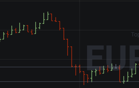
Fig. 1
The bar shows four values: the opening price (Open) as a horizontal line to the left; the closing price (Close) as a horizontal line to the right; the maximum price of the period (High) – the upper bar boundary; the minimum price (Low) – the lower bar boundary. The bar chart also shows gaps, price gaps.
It is believed that the left bar below the right bar indicates that the price is rising. If the right bar is below the left bar, the price of the asset is falling.
The size of the bar shows the activity of traders. If the bar is short (Figure 2), it means that both buyers and sellers have reduced activity, the asset is not of particular interest. A long bar with a large distance between the maximum and minimum shows that both buyers and sellers are active in the market. The distance between the minimum price and the maximum price is called a range.
But, of course, the information of one bar does not trade, you need a confirmation of the trend graphical figures.
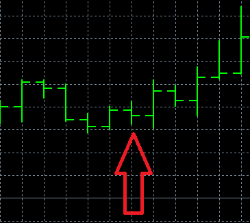
Fig. 2
On the bar chart, the trend is drawn in a straight line above the daily highs on a downward movement and below the daily lows if the direction is upward.
How to analyze bar chart information?
To analyze bar chart information, it is necessary to understand what the closing price is. It represents the price at which the last deal is made during the period of bar formation. By the closing price you can determine the mood of traders.
If the closing price is lower than the opening price, the market is probably dominated by negative sentiment. If the closing price is higher than the opening price, it shows that the market is in a positive mood.
The opening price is the price at which the first trade is executed in the selected time interval. Most often the opening price coincides with the closing price of the previous bar, and if these indicators are very different, then the chart shows a price gap.
A series of bars of small range (Fig. 3) can indicate that the market is in an unstable position, a breakthrough is possible. A series of bars with a large range indicates that there is active trading.
A series of bars, in which the highs and lows are all higher, indicates a steady upward trend. If maxima and minima decrease in a series of bars, the trend is downtrending. A series is represented not only by consecutive unidirectional bars, but also by the majority of such bars in a sequence.
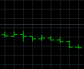
Fig. 3
The main analytical activity on the bar chart is to identify patterns.
One of the main patterns is the combination of three candlesticks, where the central bar is surrounded by bars with lower highs – this promises an increase in price. A pattern with opposite readings would be a downward reversal pattern.
A great contribution to the definition of patterns on the bar chart was made by the famous trader Larry Williams. He identified, in particular, such figures: “maximum”, “naked maximum”, “minimum”, “naked minimum”, “inner day”, “outer day”, “break up” and a number of others. All of these figures are two- or three-bar.
In particular, the “maximum” pattern consists of three consecutive candlesticks, the maximum of the central one being higher than the maximums of both candlesticks on the sides. This candlestick shows that the trend will move downward. The “minima” consist of three consecutive candlesticks, where the minimum of the central candlestick is smaller than the minimum of both candlesticks on the sides. This is also a reversal combination, which shows that the trend will move upward.
The “Inner Day” pattern (Fig. 4) is a combination of two candles, of which the highs and lows of the second bar are smaller than those of the second bar. The trend direction is determined by the second bar. The outer day is a combination of two bars, of which the highs and lows of the first bar are smaller than those of the second bar. The trend direction is determined by the second bar.
The combination of three consecutive bars in which the third bar in the sequence shows a lower minimum to the minimum of the previous bar shows a trend reversal from a downtrend to an uptrend. The opposite pattern is a combination of three bars, the last of which shows a maximum above the maximums of the previous bars. In this case, the uptrend changes to a downtrend.
Classical figures are also clearly visible on the bar chart and they are similar to similar figures on the candlestick chart. Among the typical shapes are “double top”, “double bottom”, “head and shoulders”, “flag and pennant”, “triangles”, “rectangle” and others.
“Double Top” and “Double Bottom” are considered to be strong reversal patterns. A double top is formed when the trend meets a strong resistance level and reaches highs twice at about the same level. The figures show that the trend is changing to a downward one. A double bottom is an antagonistic pattern, it is formed by two lows with a small bounce between them. This pattern signals an uptrend.
“Head and shoulders“is a classic reversal figure, which looks like three peaks, of which the center one is the highest. The peaks on the left and right are not always equal. An important sign of the pattern is the crossing of the support line by the price of the asset. The pattern is formed following an uptrend and creates a downtrend. “Head and shoulders” shows that there is a massive supply in the market and the price of the asset can fall heavily.
“Flag” and “pennant” – trend continuation patterns. The “flag” is formed by two trend linesThe trend lines are formed by two converging trend lines, which deviate up or down from the trend, thus indicating in which direction the trend will continue. “Pennant” is formed by two converging trend lines and also shows in which direction the trend will continue with a significant slope or rise of the trend lines.
Triangles on a bar chart come in many forms. An upward triangle indicates a rising trend, regardless of what the trend was before the pattern was formed, but more often an upward triangle is formed on an uptrend. A downtrend triangle indicates a downtrend regardless of what the trend was before. The pattern is formed by a distinct support line and a downward resistance line.
Advantages and disadvantages of the bar chart
The bar chart has few disadvantages, it belongs to one of the most popular charts, which is preferred by many leading traders. One of the advantages of the bar chart is that it shows a lot of data, just like Japanese candlesticks, but bars take up less space and their perception is clearer than that of Japanese candlesticks, which take up more space on the chart. Some traders have noted that bars are better for determining support and resistance levels at small intervals.
But there is no significant difference in informativeness between the Japanese candlesticks and bars and the choice depends on personal preferences of a trader.
Among the disadvantages of the bar chart some traders refer to the fact that it does not show all of the price changes of a certain period. The data must be clarified with another chart or with a bar chart on a narrower timeframe.
Example of working on a bar chart on binary options
In the shopping mall. binary options terminal this schedule is among the main ones in the relevant section.
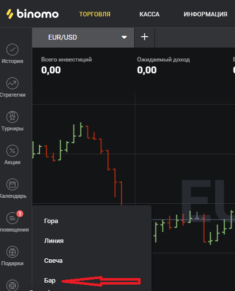
Fig. 4
One of the popular trading strategies by bars is the “Pinocchio” (“Pinocchio”) strategy.
The strategy is based on a change of trend, which should be determined by the signal, which consists of three bars.
It is believed that it is more appropriate to apply the strategy on short-term optionsThe “Pinocchio” strategy allows you to make several trades during the trading day. The “Pinocchio” strategy allows you to make several trades during the trading day.
Three candles are formed on the bar chart, of which the central candle has a long spike, “the nose of Pinocchio” – Pin Bar. The body of the Pin bar should be as close as possible in height to the level of the previous bar. The Pin bar should have a long shadow directed against the trend.
Pattern “Pinocchio” reversal, if there is a downtrend, it is recommended to buy a Call-option, if there is an uptrend, it is recommended to buy a Put-option. The “Pinocchio” strategy is also implemented on the chart of Japanese candlesticks (example).
Log in to your binary broker’s terminal, study the available chart types and work with them:
| Broker | Bonuses | Open an account |
|---|---|---|
|
1
|
50 %
Bonus on deposit from $100 USD – promo code WELCOME50
|
Start |
|
2
|
5 %
Bonus when depositing via USDT (TRC20)
|
Start |
|
3
|
Cashback
Refunds of commissions, spreads and other costs
|
Start |
|
4
|
15 %
Bonus 15% on deposit by promo code iCGSbEgiAR
|
Start |
|
5
|
100 %
First deposit bonus
|
Start |
Example of work on the bars in the forex market
In the trading terminal, such as Metatrader 5, the bar chart is among the main ones. It can be found in the “Charts” section (Figure 5).
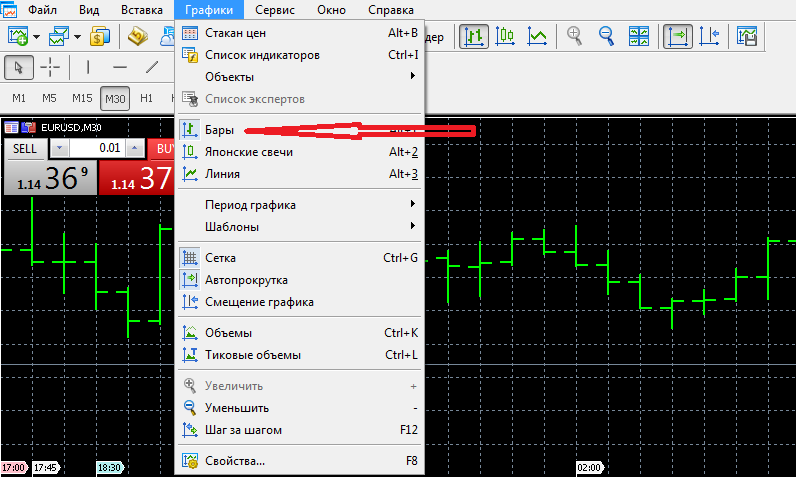
Fig. 5
One of the strategies that are implemented on the bar chart on the forex marketThe most important thing is to trade with two moving averages. It is necessary to determine the trend beforehand. Moving averages are set in the trading terminal, one of them – by minimums, and the second – by maximums of bars. Periods for moving averages are three bars.
It is supposed to buy assets at the average moving lows only in the direction of the trend, and to close positions at the average moving highs. The strategy is short-term and effective in a sufficiently volatile market.
Log in to the forex broker’s terminal, study the available chart types and work with them:
| Broker | Bonuses | Open an account |
|---|---|---|
|
1
|
50 %
Bonus on deposit from $100 USD – promo code WELCOME50
|
Start |
|
2
|
From 25 To 60 %
Deposit increase for the first deposit
|
Start |
|
3
|
Cashback
Refunds of commissions, spreads and other costs
|
Start |
|
4
|
100 USD
Loyalty program remuneration
|
Start |
|
5
|
20 %
Bonus and cashback by promo code revieweek23
|
Start |
Example of bar charting in cryptocurrency trading
The bar chart can be used to cryptocurrency trading as well as Japanese candlesticks. If there is such a chart on the crypto exchange. In particular, trading on pullbacks can be conducted – trading against the trend. Bars show a steady rise or fall in price, and the trader trades on small corrective movements against the main trend. Such movements always accompany the leading trend, no matter how rapid it is.
In the cryptocurrency market, a rebound can be due to the fact that most traders have come to the conclusion that the coin is overvalued or undervalued. Coin price dynamics can also be affected by news or an event.
The main thing when implementing this strategy is to find an entry point into the market, which the charts, particularly the bar chart, help to determine. But it will be more difficult to do during periods of high volatility.