Types of Charts When Trading in Financial Markets
Contents
Types of stock charts
Exchange charts are a visualization of price dynamics in the market binary options, forex, cryptocurrencies and any other traded assets.
A graph (Fig. 1) is a set of prices superimposed, most often on a time interval. As a rule, the ordinate of the chart represents the price scale and the abscissa the time scale. Asset prices are plotted from left to right so that the right side of the chart shows the most recent data.
Charts allow you to quickly get information about the market situation, in particular, to determine the ratio of buyers and sellers in the market, the prevailing trend, the price value over a period of time, to carry out on the basis of this information technical analysis and to predict future developments in order to predict what will be the price of an asset.
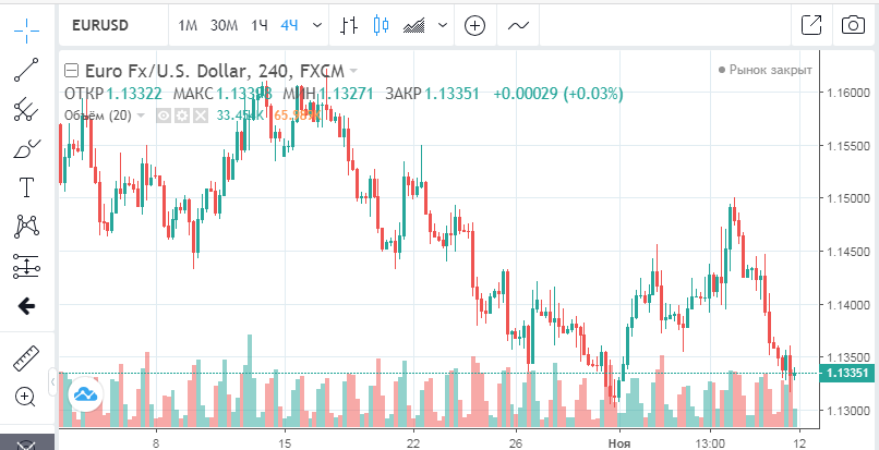
Fig. 1
Exchange charts can be classified by time and by the way prices are displayed. There are many types of charts; they differ in informativeness, number of parameters, and applicability in different conditions. But the most frequently used charts are the Japanese candlestick, zone, line and bar charts, which can be considered basic for trading almost any asset.
Technical analysis is carried out on the basis of charts, they are quite clear and convenient for this purpose, they help a trader to orient in time and understand the situation on the market, without paying too much time to mathematical calculations. But fundamental analysis can also be carried out on charts.
Traders in the markets in question mainly use daily and intraday charts, which show the smallest price movements of the asset.
Types of graphs by time and display
Minute charts
Changes in the price of an asset on the chart are shown depending on time – literally from seconds for a “pipsing” strategy to months and even years for a fundamental analysis. The price of the asset can be viewed at any point in any time period. The time period used to group quotations when constructing price chart elements is called a timeframe. On exchanges, the timeframe is set by the trader on the chart, depending on the goals and strategy.
In the binary options and forex market, as a rule, charts are built on timeframes of 1, 5, 10, 15 minutes, although you can set any time period.
В binary trading Trading on the minute chart is one of the most popular, although it is one of the riskiest types of trading. The disadvantages of trading on the one-minute chart are related to the fact that brokers cut payouts when trading short-term options, such options are difficult to predict – there is no time to conduct technical analysis.
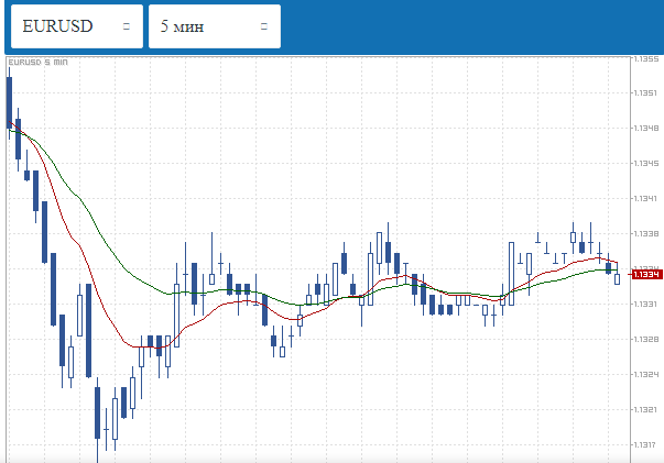
Fig. 2
In the forex market trading on the minute chart also has a high risk, because it involves the use of a few indicators to determine the entry point into the trade. Moreover, the minute chart has a higher percentage of false signals.
Both five-minute and fifteen-minute charts are popular in binary options and forex. Many trading strategies have been developed for five-minute charts (Figure 2).
Traders’ choice of time charts is based on how much time they can devote to trading. Therefore, short-term charts and strategies built for them are more popular than for longer-term charts.
Linear (zone) chart
Many traders do not consider it necessary to distinguish Linear and zone graphs (Fig. 3), because the zone graph is essentially a visually more clearly perceived line graph.
The line chart allows you to see only the price movement of the selected asset. A zone chart allows you to see the highs and lows of the market, from which the price moves in the opposite direction. These values are called zones.
For a complete prediction, a line or zone chart is not enough, you need to track additional indicators or use more informative charts. But the zone chart is good for learning to trade.
Fig. 3
Japanese candle
Japanese candle is much more informative than a zone chart. The main part of the candle is called the body. It shows the difference between the opening and closing price. Contrasting colors, usually green and red, are used to indicate price behavior. Green indicates that the price of an asset increased at the end of the trading day, while red indicates that the price decreased. The thin part of the candle is called the “shadow”, with the upper shadow showing the maximum price and the lower shadow showing the minimum price. It is generally accepted that Japanese candlesticks are easier to read than other charts and allow you to make informed decisions, even in very short timeframes.
Bars
Bars are as informative as Japanese candlesticks, but they show the price situation differently and less clearly. A bar is a vertical line, the upper point of which shows the maximum price and the lower one – the minimum. Horizontal bars are divergent from the vertical bar. The left bar shows the opening price and the right bar the closing price. If the left notch is higher, the price of the asset has fallen; if it is higher, the price has risen.
This type of asset price display optimally shows the amplitude of the financial asset fluctuation during the timeframe set by the trader or broker. This allows you to determine the volatility of the price asset and see not only the current direction of the price movement, but also the conditions of further movement.
Both bars and candlesticks, equally, allow you to predict the trend direction, reversals, determine and build price levels at different timeframes, calculate entry and exit points with sufficient accuracy, see the volatility of the asset.
Charts for working with binary options
Linear and zone graphs
The zone chart can be called a basic chart for trading binary options. On it, the dynamics of the price is displayed by the line, which passes through the points that mark the prices. This is the chart most often used by novice traders, but not only. Not all strategies require detailed technical analysis.
The line chart (Figure 4) is the easiest to follow and is used in binary options trading to establish the general direction of the price, which can be increasing, stable and decreasing. The chart is not suitable for detailed technical analysis because, in particular, it does not show the price gap. But the line chart can be used for short term trading, within minutes – such time intervals are very visible on the line chart.
Fig. 4
Japanese candle
Trading platform offers the trader to choose the type of chart, the Japanese candlestick (Fig. 5) is certainly among them, it is the most popular type of chart in this kind of trading. The largest number of strategies has been developed to work on the Japanese candlestick chart (an example of such a strategy).
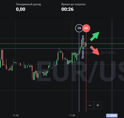
Fig. 5
The Japanese candlestick for binary options shows all the prices you need for your strategy: opening and closing prices, minimum and maximum. When analyzing the market, traders pay attention not only to the color of the candle, which shows the direction of the market, but also to its length, which shows who dominates the market, buyers or sellers, and how strong the drop or rise in price can be.
However, there is no need to look at the chart in detail in order to make a good prediction. Over the long years of using candlesticks, the basic shapes have been identified, which can be used as a guide for clear actions. It is traders who look for these figures when trading on the chart of Japanese candlesticks.
There are three kinds of such figures:
- showing that the trend will continue in the future;
- showing that the trend will soon change its direction;
- showing that the market situation is uncertain.
Here are some of the basic figures:
“Hammer” or “Inverted Hammer” are shapes that show that the trend is about to change. The hammer consists of a short candle body and a long lower shadow. Depending on the color of the candle’s body, we can see what kind of trend is forming. The green (or unpainted) hammer is in a downtrend and indicates that it is better to bet on the rise in price, the market is oversold. The inverted red hammer is formed in the ascending trend (filled) and shows that the market is overbought and it is more advisable to buy a contract for decrease.
A “shooting star” is a candlestick consisting of a short colored or red candlestick body and a long shadow pointing upward. These patterns are formed on an uptrend and signal an imminent reversal.
The “Bull Takeover” pattern is formed on a downtrend and looks like a filled candle, followed by an unpainted candle, the body of which is higher than the previous candle’s maximum.
A “bearish takeover” is when the painted body of the candle “absorbs” the unpainted body of the previous candle, such a pattern is formed in an uptrend and signals the reversal of the trend in the opposite direction.
These are not all of the existing candlestick chart patterns that can be used to build an effective line of behavior when trading binary options.
Bar Chart
Bar charts (Figure 6) are used much less frequently in binary options trading, most likely because they are less visual than Japanese candlesticks. They show about the same information, and they can also Identify typical figuresSome traders prefer bars because the shapes on the bar chart are more distinct.
The bar chart more accurately shows the dynamics of the asset’s price fluctuations. On a colorful candlestick chart, traders, especially beginners, can see the combination where there is none.
Fig. 6
Haken-Ashi chart
Gaining popularity Haken-Ashi schedule (Fig. 7) is an upgraded version of the Japanese candlesticks. In this chart each candle is related to the previous candle, the opening price is displayed in the middle of the candle. In order to predict the closing price, the sum of the closing and opening extrema is divided by four. The chart gives a more accurate prediction than traditional candlesticks. The shadow of the candle on the Heiken Ashi chart indicates the strength of the trend. If the body of the candle is small and the shadow is long, pointing in one direction – up or down, according to the trend – then the trend is strong. (Example strategy: “Heiken Ashi + EMA”)
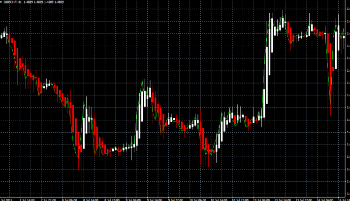
Fig. 7
Renco charts
Renco charts (Fig. 8) show the price dynamics in the form of rectangular blocks of black or white color. When the price increases or decreases by the value set by the trader, another block is added. If the price falls, the block is painted in black, if the price rises, the block remains white (other colors can also be used).
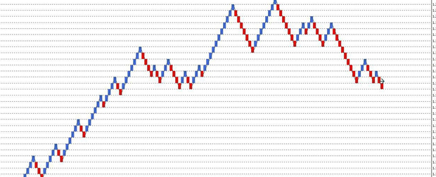
Fig. 8
Each block contains a certain number of points. The chart is tied not to time, but to the price change in pips.
The Renko elements clearly show whether the trend is downward or upward. At the moment of a reversal, blocks of different colors appear on the chart – this facilitates the task of correctly reading the signals, which arises in a similar situation on a chart of traditional Japanese candlesticks.
Since the Renko chart shows the trend very well, traders have developed rules that work on the chart in most cases: buy on unshaded blocks, especially if there are more than two, sell on shaded blocks. Also, compared to Japanese candlesticks, Renko makes it easier to make decisions, because fewer blocks are formed during a trading session than candlesticks.
Log in to your binary broker’s terminal and study the types of charts that are available in it:
| Broker | Bonuses | Open an account |
|---|---|---|
|
1
|
50 %
Bonus on deposit from $100 USD – promo code WELCOME50
|
Start |
|
2
|
5 %
Bonus when depositing via USDT (TRC20)
|
Start |
|
3
|
Cashback
Refunds of commissions, spreads and other costs
|
Start |
|
4
|
15 %
Bonus 15% on deposit by promo code iCGSbEgiAR
|
Start |
|
5
|
100 %
First deposit bonus
|
Start |
Types of forex charts
The forex market uses mainly bar and candlestick charts. The candlestick chart is the most popular in this direction. However, there are several other charts, such as tick charts, crosses and zeros, which are used in forex, although much less frequently.
Bar Chart
Most of the charts that show the basics of forex trading in books and educational sites are bar charts, although the stock exchanges are invited to trade more often on the Japanese candlesticks.
When trading on a bar chart, four prices are represented: open, high, low, and close, so the chart is also called OHLC – open, high, low, close. In trading programs, the duration of the bar is set to 1 day. But the user in the bar chart can set the timeframe corresponding to one bar of 5 minutes, 15 minutes, 60 minutes and so on. In forex trading 15-minute, hour, 4-hour and daily bars are used more often.
The most frequently occurring patterns-figures on the bar chart are “flag” and “pennant”, they can be called basic for trading with the help of patterns on the bar chart. The pennant pattern resembles a symmetrical triangle, the flag pattern resembles a parallelogram. Both patterns are formed from one to three weeks – and represent a kind of a pause of the current trend, but they exist shortly and show that a pronounced trend will continue.
Tick chart
The tick chart (Figure 9) is not attached to the timeline (although it can be attached to time). When price changes begin, the chart moves horizontally by a small step – “tick”. That is, a tick shows each change of the quote. By the number and frequency of ticks it is possible to determine the market activity, the trader can efficiently determine Support and Resistance Levels. The tick chart itself is not used for theanalysis, but it can increase the accuracy of analytics.
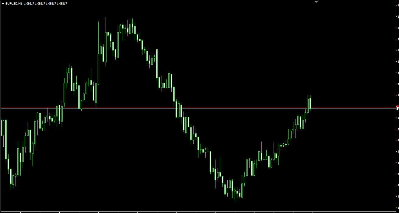
Fig. 9
The “Tic-tac-toe” chart
You can’t call a “crosses and zeros” chart common, the chart is based on “crosses,” which means price increases, demand, and “zeros,” which means price declines, supply. There are only crosses or only zeros in one column. It will take some time and a good knowledge of the market to learn how to use this chart, but it already has many fans because it has some positive features: it can literally be built on a piece of paper, it is easy to determine the trend, it is easy to determine the resistance and support lines, and the analysis is not affected by minor price fluctuations – “market noise.
Breakdown chart of the three lines
The graph of breakdown of three lines is also not used very often, although it shows more accurate prediction results than the Japanese candlesticks. The chart combines features of a bar chart and a point chart (tic-tac-toe). The opening or closing price on the chart is represented as a line, it is the main line. Other lines begin at the price level of the previous line. If an increase in price is marked, the line is drawn, for example, in white, and a decrease in price – in black. If there are three lines of the same color, the trend direction is confirmed.
Kagi’s schedule
The Kagi chart is one of the non-standard types of charts, which can be considered a variation of the “tic-tac-toe” chart, it also does not take into account the time parameter and it also allows you to get a deep understanding of trends in a simplified form. And Kagi can also be depicted on paper.
Fig. 10
The Kagi chart is depicted by parallel vertical lines connected by short horizontal segments of equal length. The vertical line is the price movement in one direction. When the line advances by a certain amount, a new vertical line is drawn, which connects with the previous with a horizontal line. The price line can be thick – Yang, and thin – Yin.
The Shoulder line connects the Growth line and the Fall line, the Waist line connects the Fall line and the Growth line. When Yin is above the previous Shoulder, it becomes Yang, conversely, when Yang is below the Waist, it becomes Yin.
To work with the Kagi chart there are clearly established rules that work in most cases: buy at the beginning of Yang, sell at the beginning of Yin, mark support and resistance lines, the reversal will be after 10 consecutive shoulders or waist.
Log in to your broker’s terminal and study the types of charts that are available:
| Broker | Bonuses | Open an account |
|---|---|---|
|
1
|
50 %
Bonus on deposit from $100 USD – promo code WELCOME50
|
Start |
|
2
|
From 25 To 60 %
Deposit increase for the first deposit
|
Start |
|
3
|
Cashback
Refunds of commissions, spreads and other costs
|
Start |
|
4
|
100 USD
Loyalty program remuneration
|
Start |
|
5
|
20 %
Bonus and cashback by promo code revieweek23
|
Start |
Types of stock market charts
The movement of asset prices in the stock market is mainly displayed by line charts, bar and Japanese candlesticks.
Linear charts are used to quickly determine the price trend. In addition, a line chart is best suited for studying price dynamics over several years. And in the media, in order to show the state of the stock market to the readers, a line chart is used.
To confirm the information of the line chart, a volume chart is used – the total number of concluded transactions during the trading day. For example, an increase in volume confirms the current trend, while a decrease may warn of a change in the trend to the opposite.
Bar charts in the stock market are preferable for trading, they contain more generalized information for a certain period of time, shown in a compact form. A bar chart becomes difficult to read if many time periods are analyzed. Traders use daily or even shorter bars in their work.
Bar charts are the most popular in the stock market. But Japanese candlesticks are also often used, because it is believed that the patterns that form on a candlestick chart over several days allow you to see important signals about market trends.
Types of cryptocurrency charts
At cryptocurrency exchanges The Japanese candlestick chart is most often used by default, although bar and line charts are also used. The analysis of information presented on a crypto-exchange chart itself is no different from the analysis of forex or stock market information and all kinds of other charts are applicable to it.
But because the cryptocurrency market is the most volatile, for it is more important to predict the price movement in advance, the information of one chart is not enough – and the charts, which involve a long analytical work, are not suitable.
Trading on the chart on the crypto market is necessarily complemented by other tools with which the trader is constantly verified, for example, with the indicators of the trading volume of cryptocurrency.
On a crypto-exchange chart, trading volume indicators are usually located at the bottom of the chart. In this chart, the height of each column corresponds to the trading volume for a certain period. The analysis of trading volume allows predicting the market sentiment – for growth or decline in price.
In addition, for the cryptocurrency market is important information of the quotation stack, the indicators of all transactions made over a certain period of time (vertical volume) and is extremely important news background.
Enter the terminal of the crypto exchange and study the types of charts available in it:
| Exchange | Bonuses | Registration |
|---|---|---|
|
1
|
Until 4000 USD
Registration Bonus
|
Go to |
|
2
|
Until 10000 USD
Welcome Bonus
|
Go to |
|
3
|
2 USDT
Welcome Bonus
|
Go to |
|
4
|
1000 USDT
Bonus for futures trading
|
Go to |
|
5
|
0%
Fee for withdrawal to bank card
|
Go to |
Pros and cons of charts
To consider the advantages and disadvantages of charts in each market should be applied to the specific situation in each case, taking into account the goals and objectives of the trader.
For example, a line chart is quite enough to establish the direction of the market in general terms. But it is not suitable for technical analysis, for qualitative forecasting.
On the other hand, when trading on short and very short periods, there is no particular difference in the type of chart, the main thing that it displays the price and a certain period – time or a timeless parameter, like a tick – of price changes.
And in cryptocurrencies, for example, many traders only look at the rate chart and trade on it, and the chart is only used to see the emerging trend or to confirm the current trend.
Conclusions
For all types of stock trading under consideration, the main chart is the Japanese candlestick chart. It is the most clear for traders, it is set by default by brokers on trading floors, and it is informative enough for any type of trading.
The bar chart is also used by many traders as a full-fledged analogue of the Japanese candlesticks. The line chart is used to track general market trends, it is most commonly used in stock market trading. The line chart is also suitable for trading on short timeframes. The tick chart is quite popular in the forex market.
At the same time, there are many other types of charts in each type of trading, which allow traders to analyze the market in more depth, mainly such advanced charts are used by more experienced traders to correct the information of mass application charts.
A trader can choose any chart, but the method of charting price data is not as important as the ability to analyze chart information. To apply all charts in any market, additional training is required; one cannot enter into trading without understanding in detail the specifics of each of the charts, without learning how to set the time frame, without understanding what the elements of charts, especially complex ones, signify. It is also necessary to learn to see the figures on such charts as Japanese candlesticks and bar charts. It is best to try your chart reading skills on demo account.